Mindbody Calendar
Mobile Application Feature Addition
Overview
In SFU's Interface Design course, I was tasked with adding a feature onto an existing mobile interface; the feature in question must follow the visual language of the existing interface while also making sense given its existing interactions. With this, I chose to build my idea on top of Mindbody, an online scheduling platform that specializes in providing users with classes, appointments, and events that pertain to fitness, wellness, and beauty. The application simplifies the process of exploring and researching new services while also making the booking and registration tasks to be intuitive.
Role
Type
UX/UI Designer, Prototyper
Academic
Timeline
Tools
2 weeks
Figma
Problem
To ideate a suitable feature for Mindbody, I analyzed the application from the perspective of a consumer wanting to find an activity to increase their fitness. With this, I went through common tasks in the workflow that would lead the user from the initial registration page, searching through the wide variety of activities, and to the final checkout for booking the class. The specific tasks that I analyzed include navigating through the application’s explore page, utilizing the interface’s filtering system, and using the maps feature. I took an approach like this to get accustomed to how a consumer would think (as opposed to an interface designer) and also look at only the most essential elements of Mindbody to a casual user — looking through the variety of services, choosing a favourite, and booking it.

Upon navigating the application, I found that sorting through bookings was relatively difficult, forcing users to scroll through a multitude of activity listings to get to their desired reservation. To users who do not seek to book many classes, this design choice would not be much of an issue but can be difficult for those with many. The lack of a long-term-based scheduling system makes it difficult for users to plan ahead or retrieve information from older bookings. With this, I propose to integrate a calendar feature to help users visualize their schedules on a more macro scale.
Mindbody's Existing Schedule Feature
Calendar Ideation
Calendars are not a new concept, having been done countless times by countless designers. Naturally, as I searched for inspiration I would look towards the larger and more well-known interfaces like Google and Apple. I appreciate how the two interfaces are clean, minimal, yet effective. They communicate information to users in a straight-forward manner while also being intuitive in terms of interaction.
When looking to integrate a calendar into Mindbody, I looked towards following its existing design language and overall concept. In the case of Google's more rectangular dates, it seems reminiscent of traditional calendars wrapped with a coil spine. It communicates a stronger dedication to a solely calendar-based application, while this aspect isn't and shouldn't be the main focus of Mindbody.
Existing Calendar Interface Inspiration
I appreciate Apple's minimalist design, without the use of any borders around the dates as it could generally integrate easier into a variety of applications. Although, when a date is pressed, the hover state is a red circle, which contradicts Mindbody's more rectangular general design language. It seems a bit odd to deviate this far from the reestablished conditions of the application, so I looked towards Parevent, a mobile application I had designed. Here, the dates are each wrapped in a square with dates being colour-coded according to the type of activity booked for that day. I find a design like this to integrate best with Mindbody, being simple enough while not compromising the application's main concept.
Greybox Wireframes
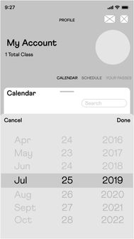
"Calendar" is a new tab added onto Mindbody's existing "My Account" page, next to the “Schedule” and “Your Passes” tabs. The difference between “Calendar” and “Schedule” is that “Calendar” shows the entire month while “Schedule” shows individual events. Users can swipe left and right from the three tabs for easy navigation.
When the search button is tapped on wireframe 1, a scroll wheel will appear allowing users to skip to the specific date and days with bookings surrounding that date (see wireframe 2). When the user slides the bottom menu up, taps the rounded cylinder in the centre, or selects any of the dates on the map, a full yearly calendar will swipe up (wireframe 3). Wireframe 2 allows users to scroll through the months, days, and years to aid them with finding their desired booking timeframe. The cancel button redirects users back to wireframe 1 while the done button takes users to wireframe 3, displaying their desired results on the calendar. Similar to wireframe 1, wireframe 3 allows users to reopen the scroll interface (wireframe 4) by pressing the search button. The rounded rectangle at the top centre of wireframe 3 will redirect users back to wireframe 1. Pressing on any date on wireframe 3 will direct users to wireframe 5, displaying an interface similar to the preexisting "Schedule" but for the searched date range.
Full Fidelity Mockups
When designing the full fidelity wireframes of the calendar feature, I decided to colour code the types of activities users are booking for simplicity and ease of access. This is particularly useful when looking at the monthly calendar, with an indicator of the type of activity taking place on that day at a glance.
Based on Mindbody's existing colour palettes for the user's activities (fitness - red/orange, wellness - green/blue, beauty - purple/pink), I decided to use these to fill in the dates on the calendar depending on the day's respective booking. These colours are also to be used in the title of the activities in the daily schedule to correspond to the indicators on the monthly calendar while also making it easier to classify when viewed.
Existing Mindbody Colour Palettes
Total Wireframes


