Parevent
Conceptual Mobile Application
Overview
In SIAT's Interface Design course, my team was tasked to create an interface of our choice. The primary concept of the mobile application we have developed is to aid parents and caretakers by having a centralized hub for booking and scheduling activities for children. In addition to general, recreational family-friendly activities, Parevent also centralizes educational facilities and wellness centres such as grooming and counselling for children.
Role
Team
User Researcher,
UX/UI Designer, Prototyper
Christine D., Rebecca S.,
Sayeema A, Quang L.
Timeline
Tools
7 weeks
Figma
Initial Ideation and User Research
The project began with a series of research domains for our team to choose from including healthcare and management, health and wellness, amongst many others. After carefully analyzing each option, we ultimately decided on pursuing the domain of parenting and childcare. With this, we began research by reading empirical articles centred on the essential needs of parents in mobile applications and conducting a series of interviews with a total of six parents with children ranging from newborns to preschool age and expecting parents.
Based on our findings, we found three common challenges and opportunities in our domain. The first of which found parents being overwhelmed with the number of quantitative aspects to track and remember in regards to taking care of a child and for pregnancy. The second had parents frustrated with the lack of resources and inaccessibility in finding preschools, daycares, and local activities online. Some noted the presence of certain Facebook groups that try to compile this data through user recommendations. Finally, the third opportunity was parents hoping to pause and look back upon the milestones that happen when raising a child such as their first words and steps. Busy schedules were often noted, causing parents to lose track of these events.
These opportunities led my team to devise three potential interactive system ideas. The first idea was an application to track quantitative data related to pregnancy and childcare. This included information regarding supplements, pregnancy symptoms, child’s food intake, hours slept, diaper changes, hygiene such as teeth brushing or nail clipping, and development milestones such as height and weight. Such information would be compared to an average, from other users or from trusted sources such as UNICEF. The second concept would centralize information on various local childcare centres, such as kindergartens, preschools, and daycares. It would also allow users to search for recreational activities, events, and classes with search filters for varying price ranges, distances, and genres. The final idea was an application dedicated to scrapbooking a variety of milestones for newborns, featuring periodical recordings of height, weight and other physical characteristics and prompting parents to record this data on time for future reference. After proposing our ideas to the instructors and our fellow classmates, we decided to move forward with our second idea to create an events application
User Personas


As a precursor to ideating the main components for our application, my team and I created two user personas to get a better understanding of our intended audience and their primary concerns and needs for such an interface. These personas serve as amalgamations of our earlier interviewees. The first persona featured new parents with goals in finding a platform centralizing a variety of family-friendly activities and classes while also increasing their social circles to other parents. Their primary concerns lie with funds, wanting their outings to be as cheap as possible due to reduced income. The second persona centred around more seasoned parents with children ranging from two years to eight years. Their main needs are finding activities that suit the interests of their children, are reputable, and can serve as both learning opportunities and entertainment. Their main frustrations are the difficulties with organizing activities for multiple children and with different ages.
With this, we came up with a variety of features essential to our interface such as:
-
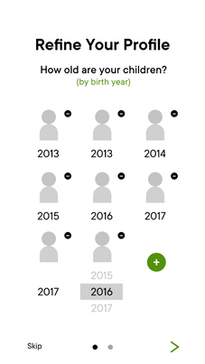
Personalized Profiles (for each child)
-
Detailed Search Filters
-
Explore/Trending Events Tab
-
Calendar Scheduling
-
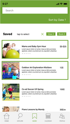
Saved/Favourites
Initial Wireflows
Based on these key features, the team created a series of sketches to generate ideas on how each page flows into one another and how each page would generally look like.
Low Fidelity Sketches

To aid with creating medium-fidelity grey-box wire flows, the team developed a rough map of the user's intended experience:
-
Opens application, prompted to sign in, but allows option to register or continue as guest.
-
Users prompted questions about the number of children, their ages, and interest. (If the user is a guest, these preferences will not be saved).
-
Land on home page, with a search bar, new options, top rated, and recommendations/popular in your area.
-
Categories buttons/tabs on the home page - Activities, Education and Childcare.
-
Search bar will feature a list of filters to narrow search queries. Can re-open filter popup to edit filters.
-
Selecting an activity from either home or explore page: brings up specific details of event/activity.
-
Register button prompts for either registration from within application or re-direct to official company website.
-
Enter payment info and option to save payment info
-
Read terms and confirmation.
Medium Fidelity Grey-box Wireflow

After creating our initial wireflows and garnering feedback from the course instructors and fellow students, we used Figma to collaborate on creating medium fidelity grey-box wireflows for our interface. Initial critiques for these wireframes included the absence of having a blank state for non-registered users, not offering a way for users to redo or clear their child's profiles in case of mistakes, and to consider adding a scheduling feature to set it apart from similar activity-tracking applications. With this, we refined our grey-box wireflows and set out to select a name, consistent colour palette, type face, and overall visual style.
Visual Style Ideation

The decision of using a sans-serif typeface was unanimous amongst the group, agreeing that having a simple and legible appearance is important for users to fully understand our interface. The application's colour palette raised numerous differing opinions, with each group member agreeing that this was integral in promoting a welcoming and family-friendly aura of our interface. I played a key role in this process, finding our primary typeface in TT Commons and suggesting a multitude of colour palettes from a variety of multi-coloured gradients and monochromatic vibrant colours such as blue, yellow, and green. Having green as our main colour seemed to have resonated most in our group and through in-class critiques, being chosen as a result.
Initial Mockup, User Testing, and Feedback
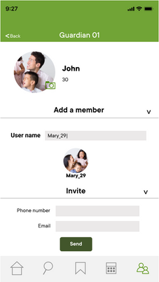
Moving forward with our chosen visual themes, we essentially replaced our grey-box wireframes with colour, full-fidelity images, correct typefaces, and adding several missing frames in between interactions. We split our work as a group, assigning members to specific related portions of the interface. Once finished, I aided in prototyping by linking pages together through buttons.
Initial Full Fidelity Wireframes
To user-test our interface, we conducted in-person testing along with sending links to our online prototype for feedback. We had a total of six parents for our research, observing behaviours with interactions and asking questions regarding usability and functionality. Lastly, we asked if there are any functionalities they could recommend to enhance their experience.
General limitations to using Figma as our primary prototyping tool include being unable to type into search fields, scroll in certain instances, and being unable to check off certain boxes. Common performance and usability issues include having too little of a font size for body text, and too little interaction space for certain icons. In regards to user experience issues, parents expressed a variety of concerns for our team to take into consideration including addressing free events that do not require registration, the absence of registration deadlines, and the oversimplification of children's details (lacking emergency contact information, home address, allergies, etc).
Complete User Feedback and Potential Solutions

Final Thoughts
Addressing our user feedback, we refined our mockup by improving on key usability issues such as increasing font sizes, interaction spaces for buttons, and increasing stroke sizes for certain icons such as the bottom navigation menu. We have also included new features such as a user rating section, the importing of third-party calendar applications such as Google and Apple, and prompting users to fully complete their children's profile by answering more detailed questions depending on the event/activity. I went through and edited each frame, ensuring that consistent font size, weight, colour palette, and position were used across the interface.
For future consideration, it would be beneficial to have members have more specific and designated roles on the team rather than splitting the work evenly. I found that this caused the project to appear inconsistent in aesthetic and became quite a challenge to tidy up at the last minute. Although my group and I naturally settled into our unspoken roles towards the end, some working more towards prototyping, others designing our presentations and slides, this would have helped against members unknowingly working on similar aspects of the project. Having completed the project in the midst of the COVID-19 pandemic, another consideration would be to plan ahead with our meetings and the platforms where the meetings would take place. As the group could not meet in person, it became apparent how difficult it was to communicate ideas.


